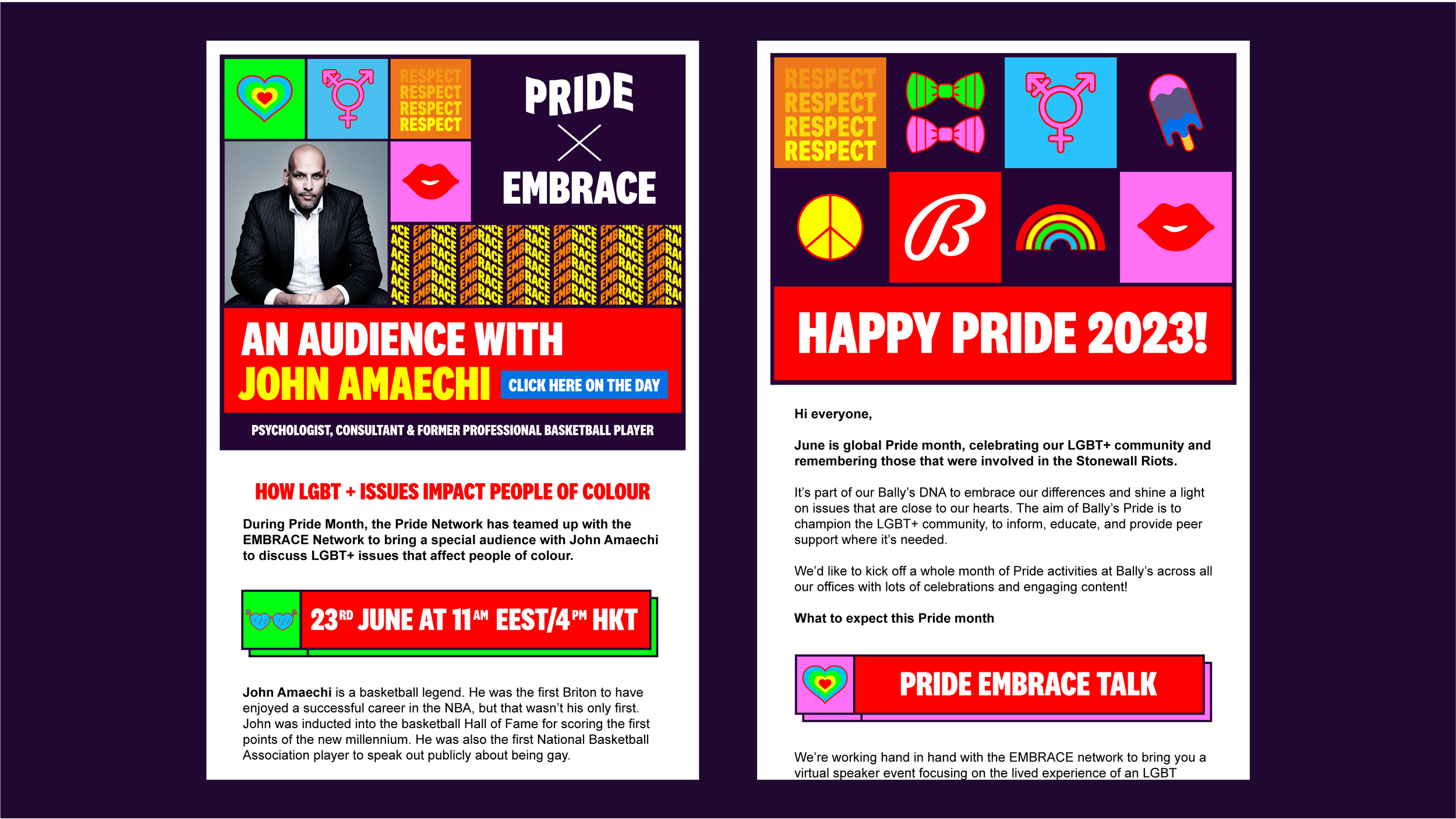
PRIDE NETWORK
BRANDING | VISUAL IDENTITY
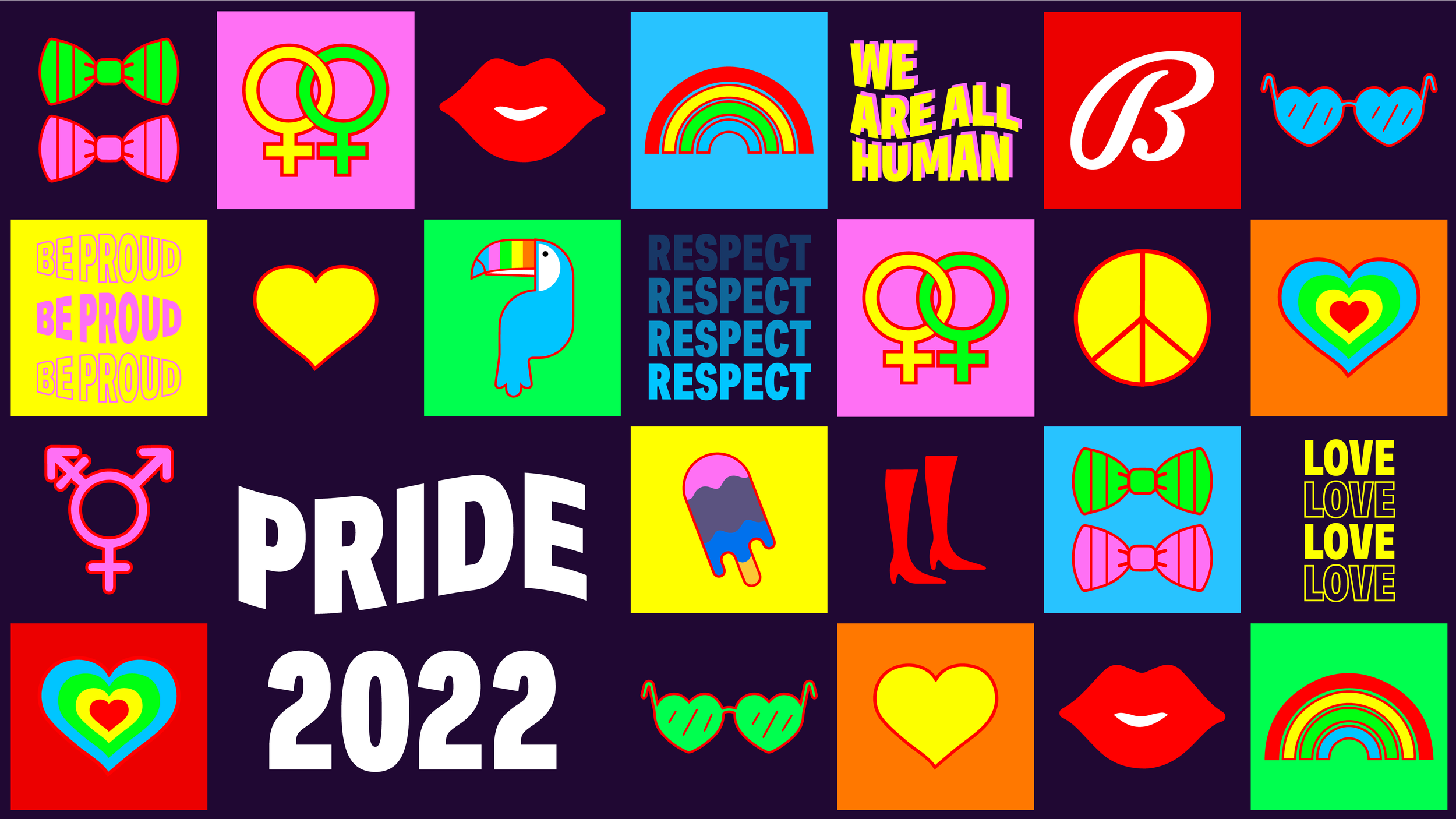
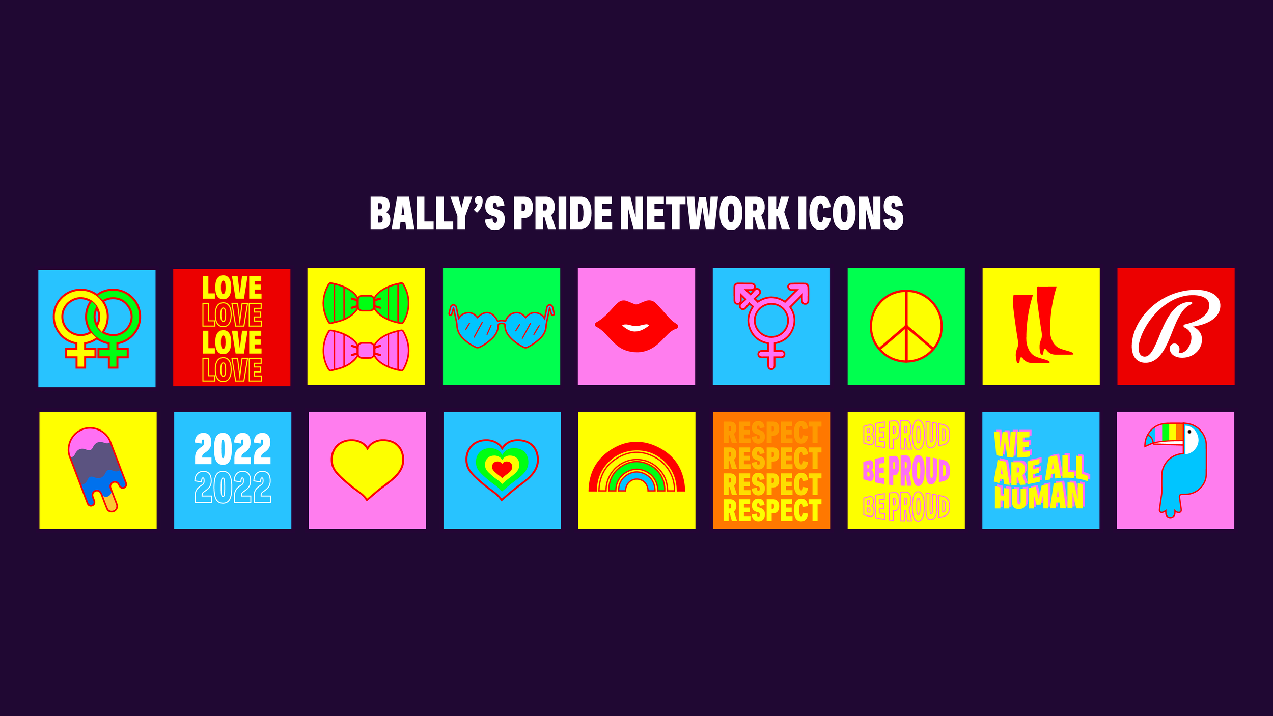
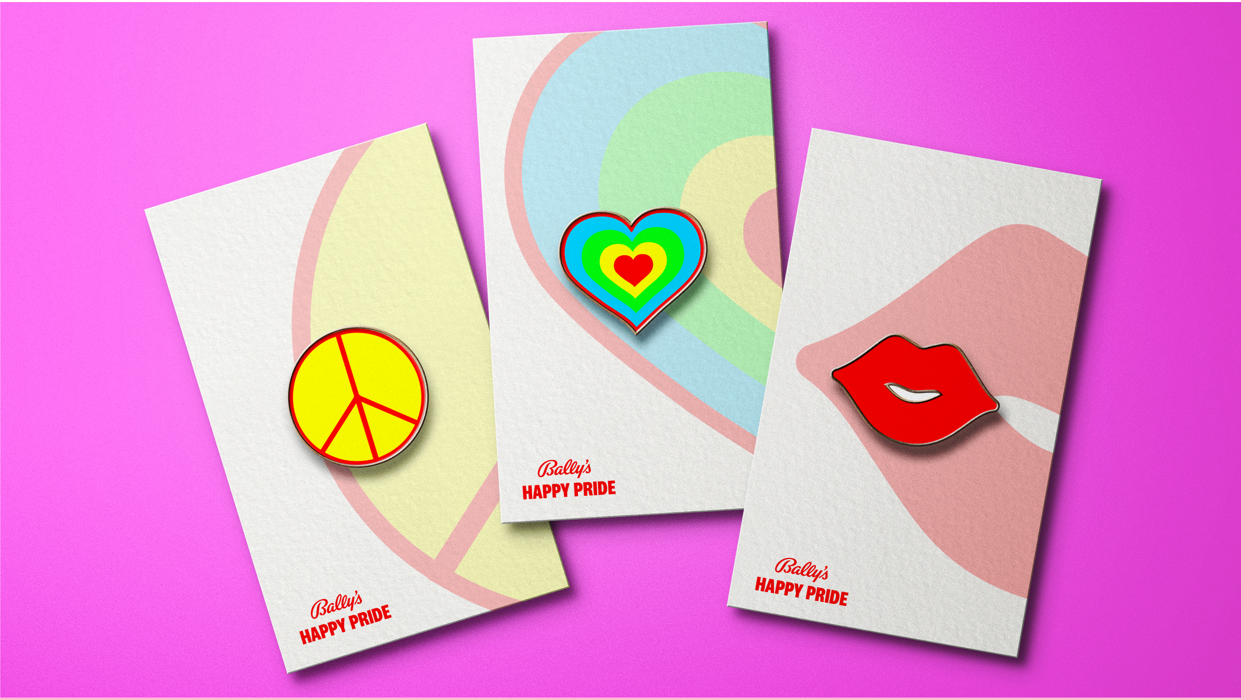
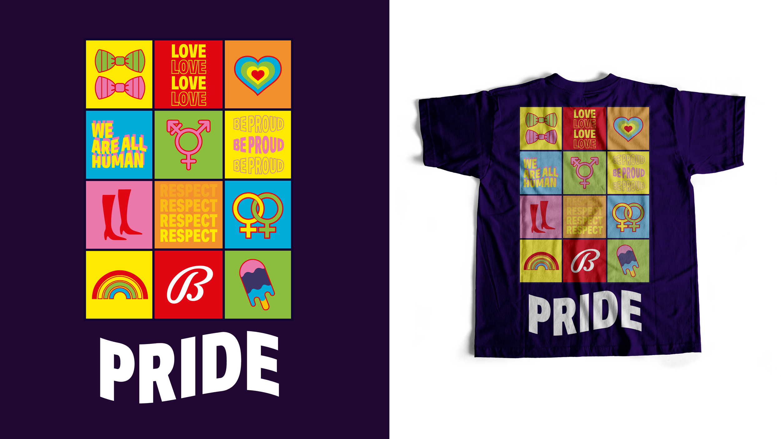
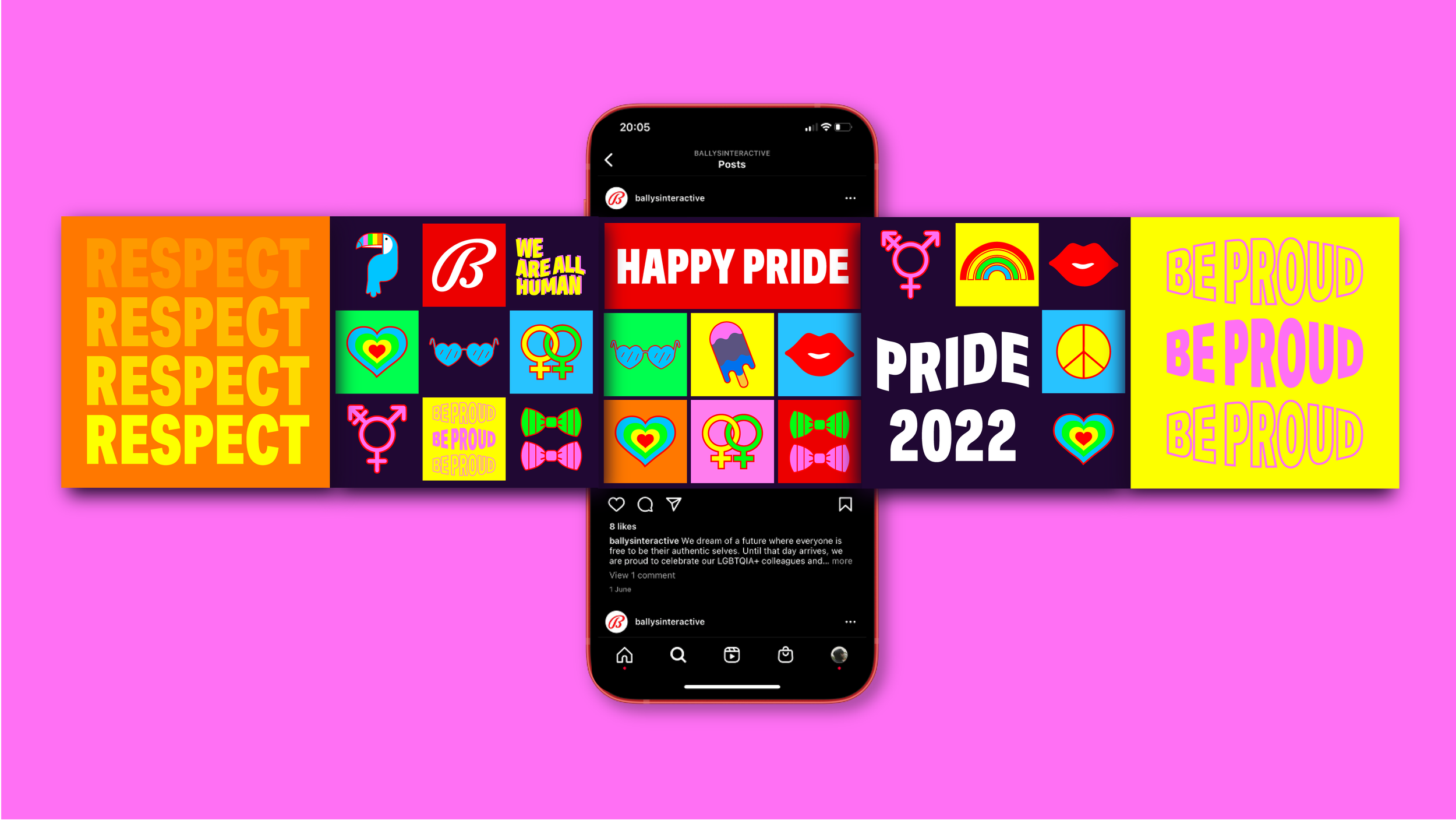
The Pride Network's rebranding concept centers around a dynamic visual identity inspired by iconic Pride icons and the colors of the Pride flag. Incorporating recognizable symbols like the rainbow and heart, the design resonates with the core values of the LGBTQ+ community. The six colors of the Pride flag form a vibrant and meaningful palette, representing the diverse facets of the LGBTQ+ experience.
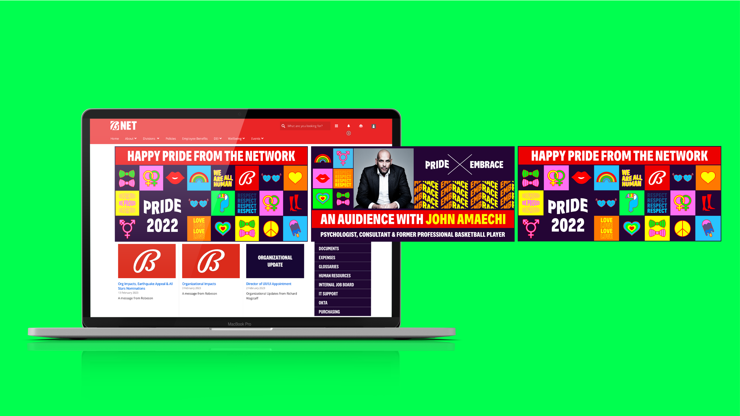
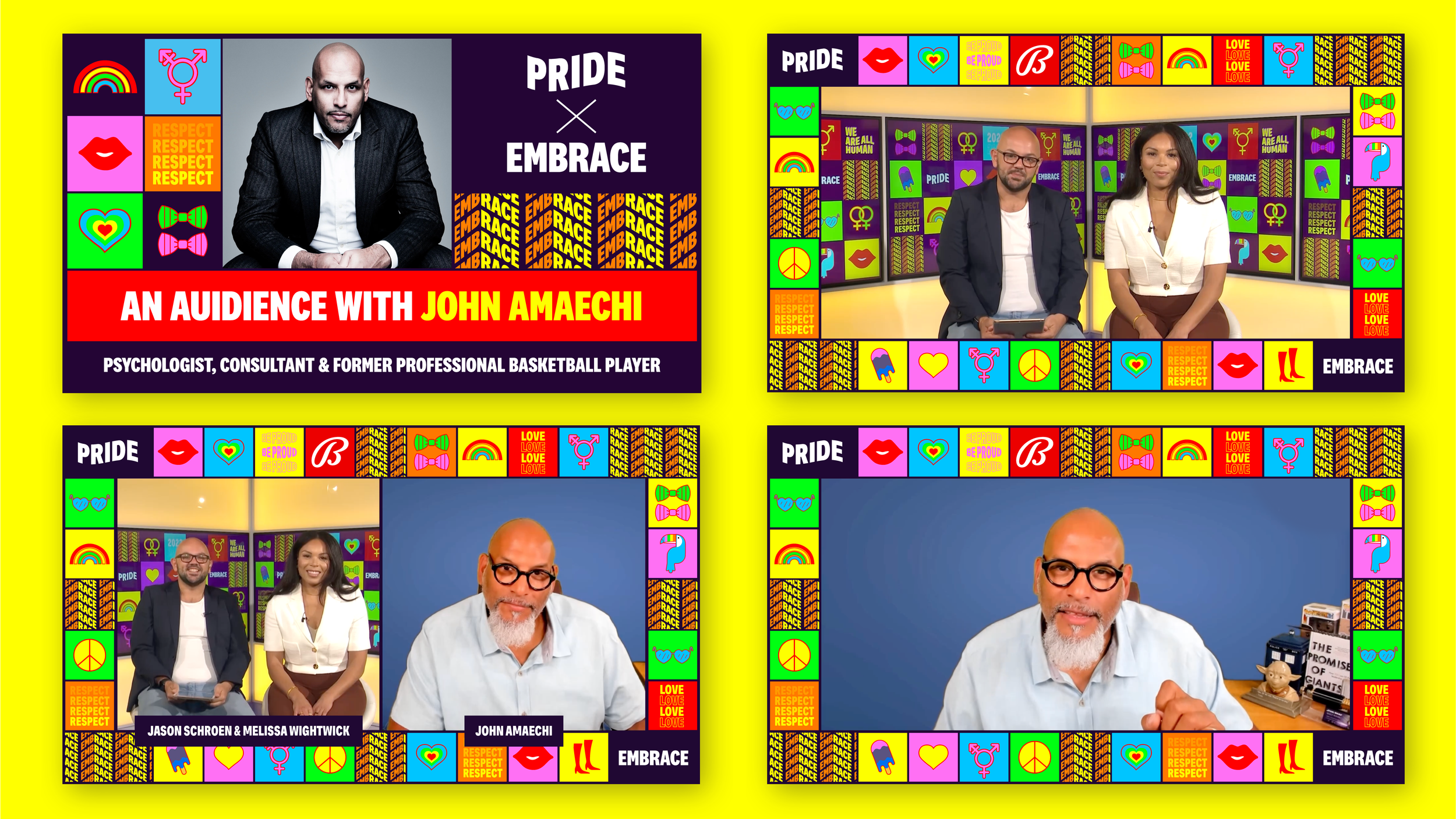
At the heart of the concept lies a modular design system, providing the freedom to rearrange icons and colors while maintaining a cohesive identity that evolves alongside the dynamic nature of Pride. This adaptable approach ensures the design's suitability across both digital and print media, establishing a consistent presence on various platforms. Through interactive elements, the rebranding encourages audience engagement, fostering inclusivity and active participation. While evolving over time, the design remains anchored in established symbols, preserving its relevance and timelessness.
Additionally, the modular system lends itself to nuanced storytelling, allowing customization for different Pride events, campaigns, and narratives. Its versatility extends to various projects, accommodating different initiatives while upholding the values of self-expression and inclusivity. Overall, this rebranding concept encapsulates the essence of Pride, blending iconic symbolism with an adaptable design to invigorate the Pride Network's identity while staying true to its fundamental principles.